
Color Theory, In Practice
How to understand why certain colors work together and use that knowledge in your everyday style

Color Theory, Explained and Then Seen
Color theory sounds technical, maybe even intimidating, but at its core it’s simply a way to understand why certain colors feel good together. It’s not meant to box you in, It’s meant to give you confidence!
Think of it as a language. Once you understand a few basics, you start speaking it more intuitively.

The Basics
Everything starts with the primary colors (as I’m sure we remember from our grade school days): red, blue, and yellow. These cannot be created by mixing other colors.
From there come the secondary colors: green, orange, and purple, each made by combining two primaries.
Then there are tertiary colors, the in-between shades: olive, rust, teal. These are often the most wearable because they’re softened and nuanced. Less obvious. More interesting.
These basic concepts remind me of one my favorite books to read with my kids. Mix it Up by Hervé Tullet. Its such a great interactive book for kids to learn about colors. Shout out to my artist sister for introducing me to it! Ok, back to Color Theory—
Once you see these relationships laid out on a color wheel, patterns emerge.

Complementary colors sit opposite each other (blue and orange, red and green). They create contrast and energy.
Analogous colors sit next to each other (blue, teal, green). These feel cohesive and calm.
Triadic are colors that sit equally apart on the wheel. They create balance with a bit more visual interest than analogous pairings.
Tetradic are two sets of opposite or complimentary colors. They’re bold and dynamic, and work best when one color dominates and the others support.
Monochrome looks use different shades of the same color to create depth without contrast.
Split Complimentary is a base color plus the two colors on either side of it’s complementary color.
Next, you have how dark, light, pure or intense a color is.

Hue is the fundamental family color name like red or blue.
Saturation is how intense the color is. Changes in saturation make the color brighter or more dull.
Value is how dark or light a color is. Pale colors are high in value and darker colors are low in value.

Color theory can seem complex, but it mostly explains something we already feel. It gives language to why one outfit feels flat and another feels balanced, even when we can’t quite explain it.
This is also why I love how brands like Tibi talk about color. Not as rules, but as relationships. It’s about contrast, tension, and intuition, not perfect matching.
Their color wheel is especially helpful because it’s grounded in how we actually get dressed. You work outward if your closet is mostly neutrals, adding color slowly and intentionally. If you already wear a lot of color, you work inward to ground it.

Color Theory, Seen on the Runway
On the runway, color has to do the work. There’s no lifestyle context, no “real life” distraction. If a combination works there, it’s because the relationship between the colors is sound.
Across Spring and Fall 2026, color theory shows up in a very real way. The same pairings appear again and again, subtle, thoughtful, and anything but random.
Cool + Deep: Oxblood and Pale Blue
Seen in collections like Prada
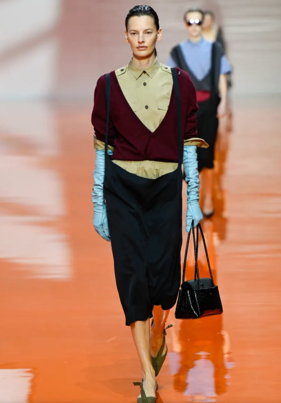
These two colors work well together because the blue is softened enough to sit comfortably next to burgundy.
It isn’t a crisp, primary blue. It’s slightly muted and greyed, which keeps the pairing from feeling sharp or overly graphic.
What’s happening here:
Both colors are leaning cool
The burgundy is cool, blue-based, and deep.
The blue is cool and icy, not green based.
These colors create strong value contrast, meaning there’s a clear difference between light and dark, which is what makes the pairing feel interesting.
This is a really good example of how value contrast can be bold while undertone alignment keeps it refined.
How to use this in your styling:
Burgundy works best with blues that are muted or softened.
Sharper blues need cleaner, clearer reds.
Deep colors pair best with other colors that carry depth.
Primary Contrast: Red and Cobalt/Navy
Seen in collections like Celine and Jil Sander


This is high-contrast color theory done cleanly, using a sharper blue.
Both colors are clear and confident, but what makes this work is hierarchy. One color leads, the other punctuates. That’s what keeps the pairing graphic, not chaotic. Red and blue work so well together in both the Celine and Jil Sander looks because the contrast is intentional and the undertones are aligned.
What’s happening here:
One of the bold colors acts as the anchor. It carries the structure of the look and keeps everything feeling calm and grounded.
The other color is the pop. It adds energy and interest, but it’s used with restraint so it doesn’t overpower.
The undertones match. The red is blue-based, not orange-leaning, so it feels crisp rather than warm. The blue is neutral-to-cool, not green-leaning.
Because they share the same undertone direction, they sit in the same family even though they’re opposites (complimentary colors).
In both looks, one color clearly leads and the other supports.
How to use this in your styling:
Red and blue work best when one leads and the other supports.
Control and proportion are what make high-contrast color feel refined.
The more saturated the blue, the more restrained the red should be.
Undertone alignment matters just as much as contrast. Red and blue work best when both lean cool or neutral. Mixing red with a green-leaning blue creates tension that’s harder to control.
This combination is a good for feeling bold and put together but not overly playful.
Layered Depth: Red and Violet
Seen at Alaïa, Versace, Will Chavarria
Red and violet sit close to each other on the color spectrum, which is why this combination feels layered instead of sharp. These two colors share a common base, so they build depth rather than contrast.


What’s happening here:
Both colors share a blue base. The red is blue-based rather than orange, and the violet leans warm rather than cool.
The values are similar. Neither color is significantly lighter or darker (similar value), so they layer without one overpowering the other.
Saturation is balanced. (reminder- saturation is how bright or dull the color is) Even when the colors are bold, they’re not fully primary, which keeps the pairing from feeling loud.
These colors are adjacent on the color wheel so the transition feels smooth rather than abrupt.
How to use this in your styling:
Pair blue-based reds with blue-based violets or purples.
Let texture or silhouette stay simple so the color relationship is the focus.
Add a neutral only if you need to ground the look.
This is a useful pairing when you want color to feel expressive and dimensional without feeling high-contrast or overly graphic.
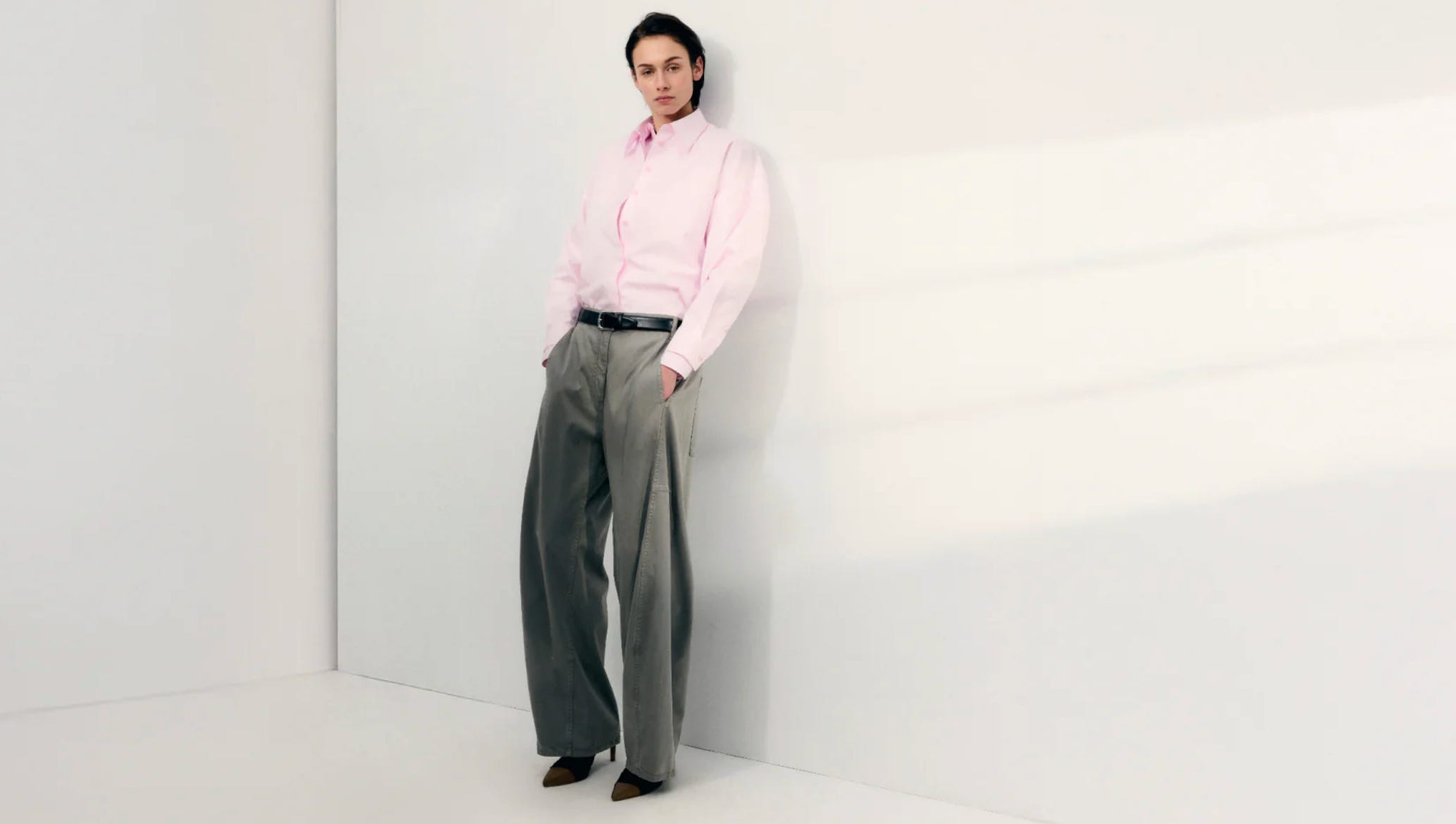
Soft Contrast: Pink and Olive
Seen at Miu Miu, Bottega Veneta
This pairing works because it’s contrast without sharpness.
Pink and olive sit far enough apart to create interest, but they’re both softened, which keeps the combination grounded and wearable.


What’s happening here:
Olive acts as a neutral. It has enough depth and earthiness to ground the look, similar to brown or khaki, but feels more modern.
Pink adds lightness. It brings softness and warmth without feeling sweet or juvenile.
Both colors are muted. Neither is fully saturated (brightness/intensity), which keeps the pairing calm rather than playful or loud.
The undertones are compatible. Olive leans warm and yellow-based, and the pinks used here tend to be dusty or blue-based, not sugary.
How to use this in your styling:
Treat olive as your base neutral, replacing black, brown, or navy.
Add soft or dusty pinks rather than bright or candy tones.
Let olive carry the structure and pink act as the lift.
Keep silhouettes simple so the color relationship feels intentional.
This is a great example of how color can feel fresh and interesting without ever feeling bold. It’s subtle, modern, and very easy to translate into everyday dressing.
A Simple Formula for Everyday Color
If runway feels far removed from real life, here’s how to use all of this daily.
The Formula
1. Choose one anchor color
Your base. Something familiar or grounding.
Examples: navy, olive, brown, denim, grey, black.
2. Add a color that balances the anchor.
If your base feels heavy, add something lighter.
If it feels cool, add a bit of warmth.
3. Soften the saturation
If one color is bold, let the other be muted.
This is what keeps outfits intentional, not loud.
4. Ground with a neutral
Shoes, bag, or outerwear quietly stabilize the look.
Real-Life Examples
Olive trousers + pale pink knit + brown shoes. This combination is actually on Tibi’s homepage right now.
Burgundy skirt + light blue shirt + brown boots
Navy or soft blue trousers + blue-based red knit + neutral flats
Blue-based red sweater + violet or plum scarf + denim
I hope this helps deepen your understanding of color theory and gives you a few new ways to integrate it into your personal style. Let me know if you try any of these combinations.
Until next time!