
Decoding 2026 Color Trends
A Return to Color, Confidence, and Fun

DECODING 2026 COLOR TRENDS
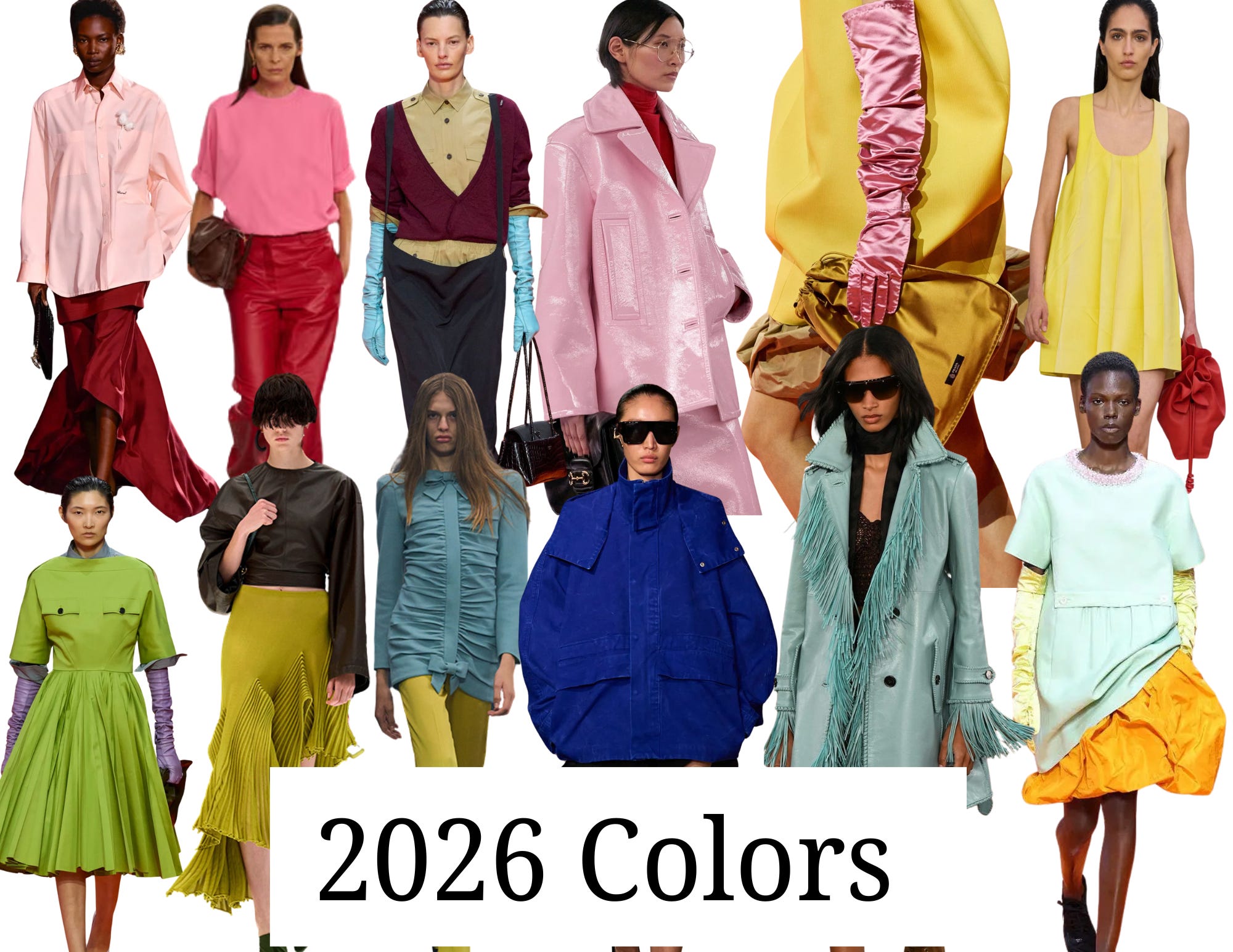
Loud. Sophisticated. Unapologetically Colorful.
Let’s just say color is back and in a big way. It was everywhere on the Spring 2026 runways, and I’m genuinely excited about it. Things have felt a little dull lately. Very tonal. Very safe. A bit bland, if we’re being honest.
And listen, I love a good minimalist moment as much as the next girl, but at some point, we have to have a little fun again.
While Pantone named white, specifically “Cloud Dancer”, as the 2026 Color of the Year (which, respectfully… we’re not accepting), the runways are telling a very different story. Color isn’t whispering right now. It’s showing up bold, confident, and incredibly refined.
Think less “pop of color,” more commitment.
“Pink is no longer being treated as feminine fluff. It’s powerful, playful, and very self-assured.”
After years of safe neutrals, quiet luxury, and tonal beige everything, fashion is swinging the pendulum back toward expression, emotion, and presence. Color blocking. Saturated hues. Tonal dressing that feels intentional, not chaotic.
Here’s how I’m decoding 2026.
WHAT THE RUNWAYS ARE SAYING
At Spring 2026 shows from houses like Celine, Prada, Valentino, Aalia, color wasn’t used as a pop or small add on it was the message.
We saw:
Strong color blocking
Tonal dressing in saturated hues
Fewer “safe” neutrals, more confident color stories
Colorful outwear and accessories
THE TOP 5 COLORS DEFINING 2026
1. Pink (Fuchsia to Baby Pink)
Pink is everywhere and I have to say I love it. I’ve never been a huge pink fan, but I’ve been seeing it in a whole new light. Its feminine and soft, yet in the right shade edgy and sophisticated.
Fuchsia is bold, energetic, and undeniably confident. Muted pink brings softness and sweetness, but still feels modern when styled cleanly. What I love most? Pink is no longer being treated as feminine fluff. It’s powerful, playful, and very self-assured.
Why I love it:
Pink carries optimism without being naïve. It’s joy with backbone.


&other stories dress, Reformation lace skirt, Sezane sweater, Khaite blouse
2. Yellow (Butter & Marigold)
Yellow continues its rise, but it’s evolving.
Butter yellow feels creamy, warm, and elevated, easy to wear but never boring. Marigold brings a richer, earthier depth that feels soulful and grounded. Together, they strike that perfect balance between optimism and sophistication.
Why I love it:
Yellow feels hopeful without being loud. It’s warmth you can actually live in.


Free People Skirt, Doen Dress, Cos Twist Top, Baleneciaga bag
3. Blue (Cobalt Blue & Neutral Blue)
Blue is having a very smart moment.
Cerulean is crisp, electric, and expansive it feels intellectual and refreshing. Pale blue softens things up, adding calm and ease without tipping into boring. With the right shade it can feel modern and unexpected.
Why I love it:
It’s confident, modern, and endlessly wearable.


&daughter sweater, Madewell sweater tank, Vince satin pants, Clare V bag
4. Red (Fiery, True Red)
This is not last year’s polished red.
2026 red is vivid, emotional, and intense. It shows up as a statement, often worn head-to-toe or sharply contrasted. It’s bold, yes, but also incredibly chic when done with intention. This color also looks incredible when color blocked with other bold colors. That is a look that is impossible to ignore.
Why I love it:
Red demands presence. It’s powerful, direct, and impossible to ignore.


Roucha jacket, Still Here jeans, Aritiza top, Suede bag
5. Green (Chartreuse & Acid Green)
Green is the wildcard—and that’s exactly why it matters.
Chartreuse is sharp, electric, and slightly uncomfortable. It doesn’t try to blend in, and that’s the point. It shows up when fashion wants to provoke, energize, and wake us up.
Why I love it:
It adds tension. And tension is what makes an outfit interesting.


Jeffrey Campbell mule, Tuckernuck top, &Daughter cashmere top, Tory Burch Bag
MY FAVORITE STYLING TIPS IF YOU’RE COLOR SHY
Start with outerwear.
A jacket or sweater is the easiest entry point. It’s simple to layer on and just as easy to remove. Tie it around your waist, drape it over your shoulders, or even carry it over your bag. It lets you test color without committing to it all day.
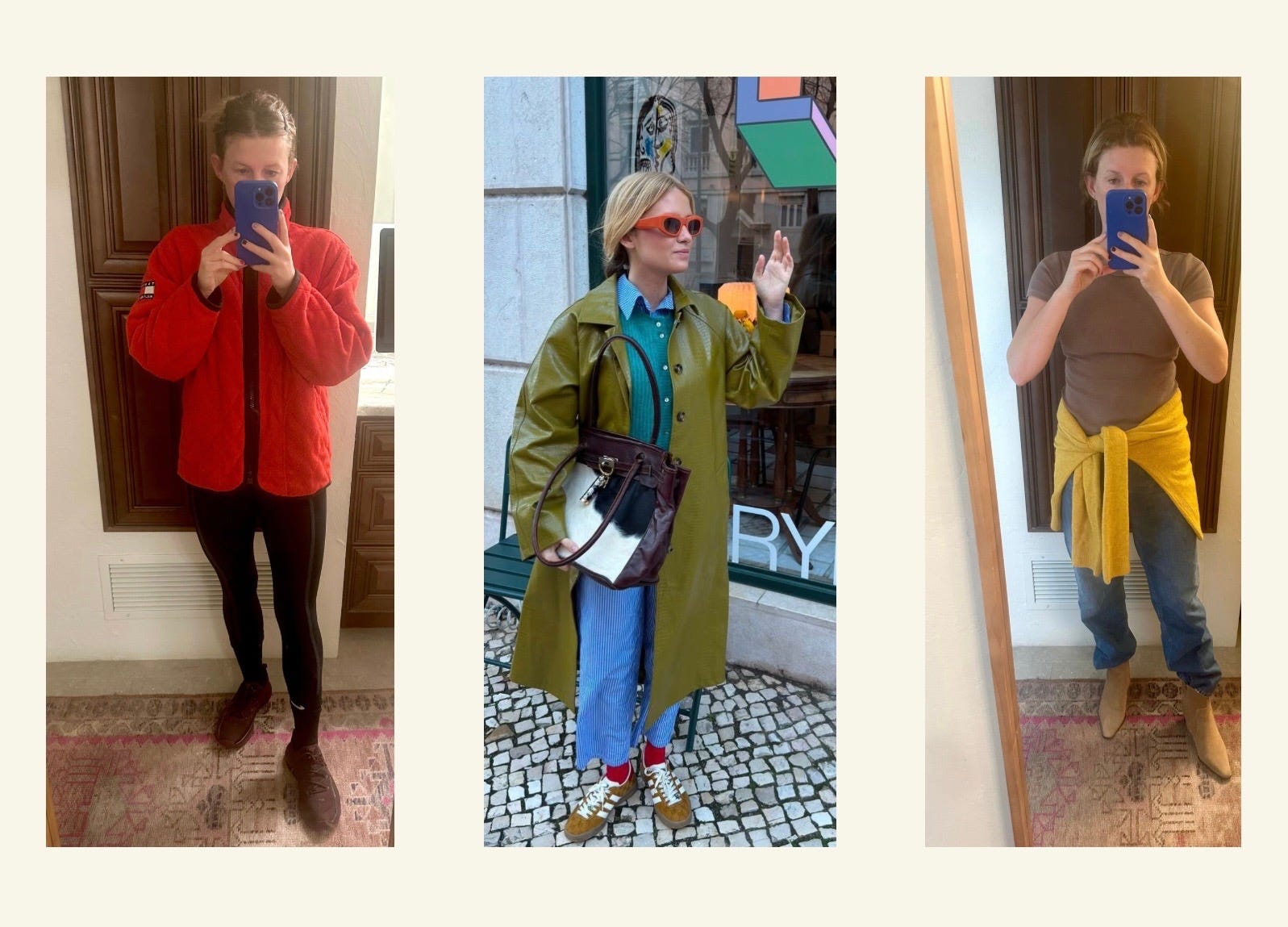
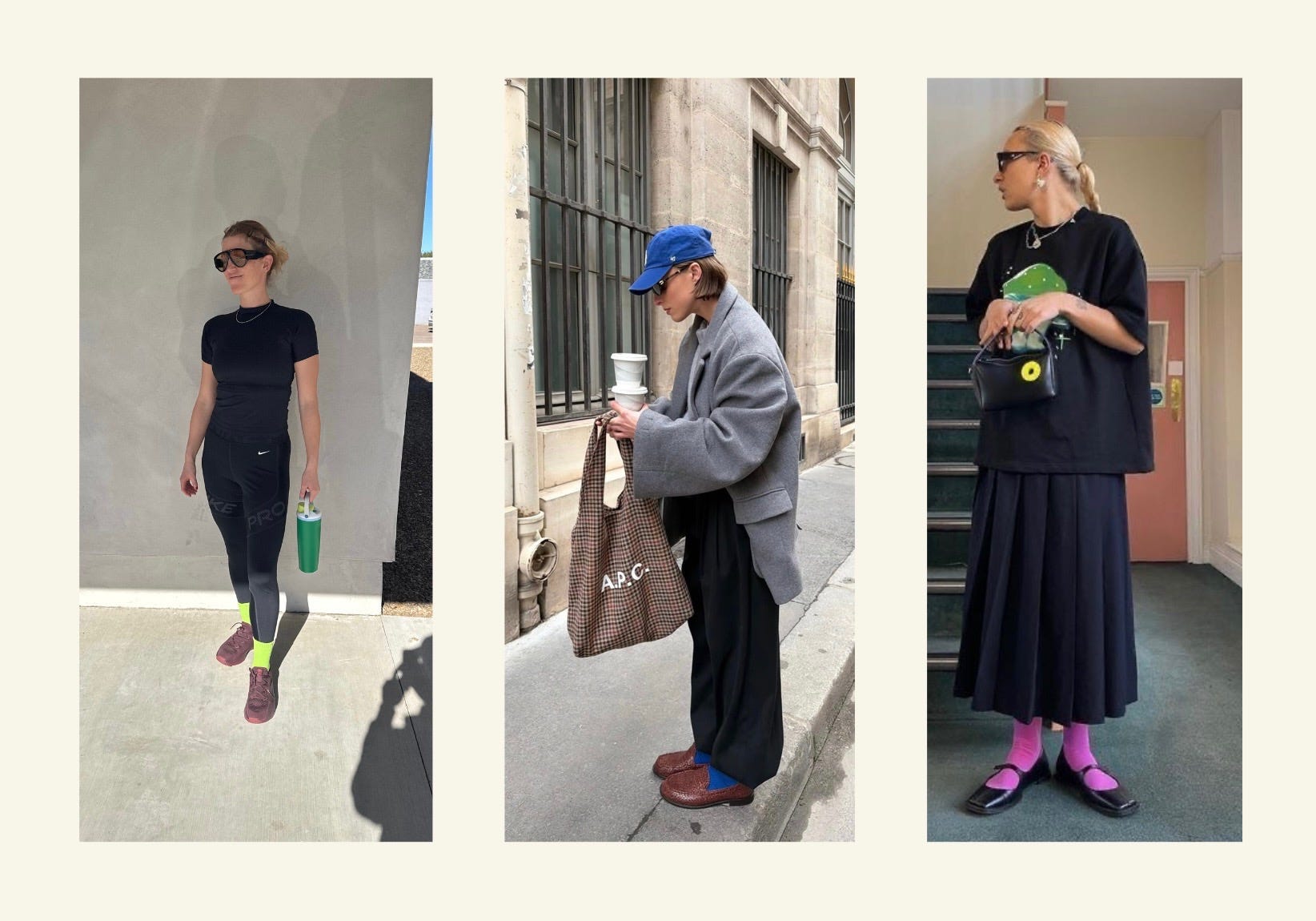
Accessories, accessories, accessories.
This is by far the easiest way to ease into color. Socks are my favorite—they’re subtle, but they make a big impact. Bags, shoes, scarves, sunglasses… small touches go a long way.
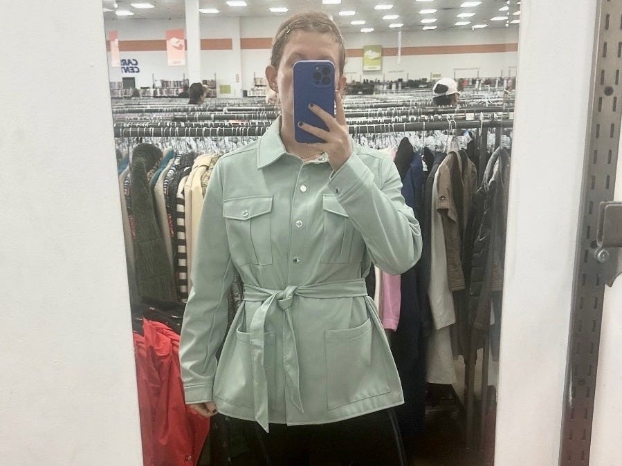
Try thrifting first.
Thrifting is such a fun, low-pressure way to experiment. You can play with color without spending a lot on a piece you might regret later. Think of it as research, not a mistake.
THE COLOR THEORY BEHIND IT
There’s a reason these colors feel so good right now and next week, we’ll get into why. How complementary and analogous colors work together, why certain pairings feel harmonious, and why some combinations just… don’t. This is where the color wheel enters the chat.

Color isn’t random. When it works, there’s structure behind the feeling.
Next week, we’ll break it down. For now? Lean into color. Wear it boldly. Commit to it fully.
Until next time!