
Good Color 101
Crash Course in color and what actually makes it "good"

What Makes a Color “Good,” Technically Speaking
I think we have all had the experience of falling in love with a color in a store, a studio, or even online. Then you bring it into your own space or go outside and suddenly it feels off. Too flat. Too green. Too cold. Too loud. A totally different color.
How could this happen? It’s not your imagination, it’s actually physics, chemistry, and material science because color isn’t a single thing. It’s an interaction. And “good” color, the kind that holds up over time and across environments, is built, not just chosen.
Technically speaking, good color is:
Stable. It doesn’t drift or degrade unpredictably
Context-aware. It behaves across lighting environments
Balanced. Not reliant on extreme saturation
Honest. It looks like itself most of the time, not just once
When color is done well, you absolutely notice it. It feels even and stable. Almost edible. The hue is clear, the tone is right, and it holds its depth over time instead of washing down or fading away. At its best, color isn’t just correct. It’s an art piece.
Good color is not an accident. It’s the result of a long chain of invisible decisions made well before an item ever reaches you. I learned this firsthand during my time at Alo Yoga, where I worked as a colorist and later led the entire color department as the brand scaled. I’ll share more of that personal journey later, but first, let’s start with the fundamentals of how color actually works.
Ok, now it is time for a crash course in color. Hopefully this is technical, informative but not too dense.
Not All Dyes Are Created Equal
First and foremost, what makes a color “good” comes down to chemistry.
Dyes and pigments vary in:
Molecular stability
Particle size and uniformity
How evenly they bond to different fibers
Some dyes are inherently unstable. They shift, fade, or oxidize over time, especially when exposed to UV light, heat, or air.
This is why:
Blacks can fade brown or green
Reds are notoriously difficult to maintain, ugh but when they’re good, they’re soo good!
Some blues stay rich for decades while others dull quickly
Neons are extremely hard to make and keep
Whites yellow over time
The first step in color is choosing it and the most streamlined, efficient way to do that is through Pantone. The fashion world speaks the language of Pantone. It’s the universal reference point for color.
My desk used to be covered in these. I would find them in pockets, my purse, my car, everywhere.

Image from Pantone
Choosing the right Pantone is the first step, but the more important step is execution. That execution depends on selecting the right dye formulations and working with dye houses that specialize in specific fabrics. Not every mill or dye house is equipped to handle every material, and expertise at this level makes a noticeable difference in the final result.
Finishing processes are just as important. Deeply saturated colors need to be finished for colorfastness, especially when they’re worn, washed, or exposed to friction. Neon colors are even more sensitive and often require additional colorfastness treatments, sometimes paired with UV finishes, to help prevent rapid fading.
A few key terms matter here:
Colorfastness: resistance to fading or bleeding
Left photo you can see a blue garment bled color onto another top in the wash. This blue garment had bad colorfastness. The photo on the right you can see the blue swatches were tested under different exposures to light to see how they faded. Images from reddit and testex textiles.
Crocking: color transfer from rubbing, either dry or wet. This happens a lot with denim


Crocking— The indigo dye rubbed off on the white shirt. Image from google
Migration: dye movement within or out of a fabric
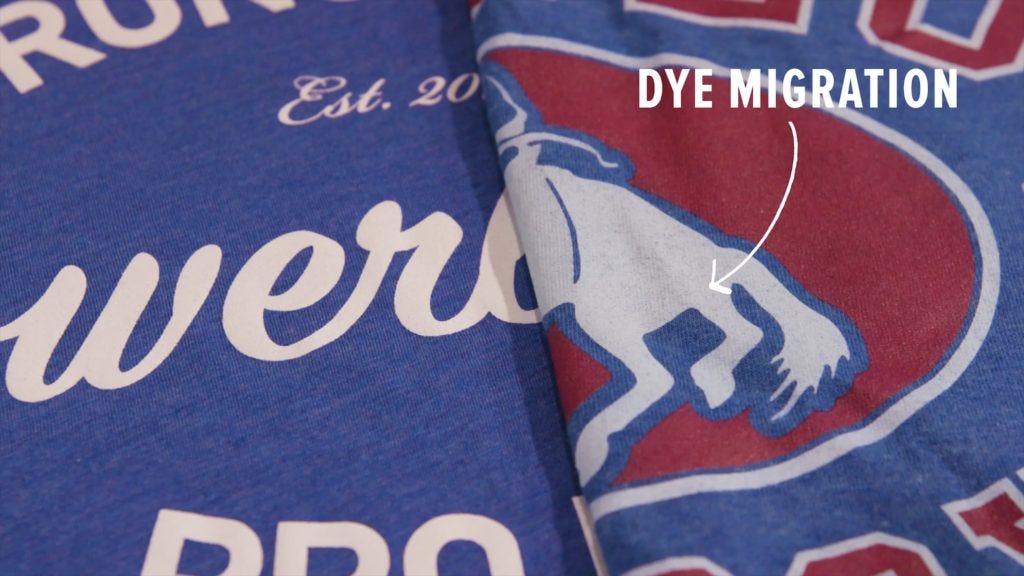
You can see here that the blue dye from the shirt bled onto the white graphic. Image from Bella Canvas

These finishing processes help stabilize color and extend its life, ensuring it holds its tone and intensity over time rather than breaking down prematurely.
And when this step is missed, the consequences can be very real. I remember when I first started at Alo, the customer service team received an email from a customer saying that after washing her garments and hanging them to dry in her shower, the fabric had dyed the shower black. (!!!) That’s a major color failure, and a clear example of what happens when colorfastness isn’t properly controlled.
Where I Learned This
Before working in fashion, I didn’t think much about how color was made.
I knew what I liked and I knew how colors worked together. If something faded or shifted, I assumed it was cheap, over-washed, or poorly made and moved on. What confused me was noticing the same issues in nicer brands too. Colors that didn’t age well or felt inconsistent depending on where you saw them.
That curiosity sharpened quickly when I joined Alo Yoga (2018), back when the brand was still early. This time period was pre retail stores, pre Alo Moves, pre celebrity saturation. They were gaining traction, but they hadn’t fully exploded yet.
One thing Alo was already becoming known for was color. They built tight, intentional color capsules that felt fresh and elevated for activewear. They were early to the studio-to-street idea, and color was a huge part of what made that shift work. These were athletic clothes that didn’t feel purely athletic and shades that felt fashion-forward, not performance-only.
But behind the scenes, color was where things got complicated.
Building Color the Right Way
When I started working at Alo, there wasn’t a dedicated color department. Responsibility was split between design and product development, so even though color was central to the brand’s identity, the actual execution was often treated as a final step rather than a system.
Over time, I stepped in and took on increasing responsibility for color approvals which allowed me to go deep into the science and processes behind color, how dyes behave on different fibers, how light affects perception, and why consistency breaks down at scale. I picked it up quickly, partly out of curiosity, and partly because once you understand how color actually works, the gaps in the process become impossible to overlook.
As the brand grew, that knowledge became essential. I moved into a role where I was running and building the entire color department. I established standards, created workflows, and put systems in place so color decisions were not subjective or dependent on who happened to be in the room that day.
That work wasn’t just about taste. It was about repeatability. About making sure a color could survive different fabrics, different lighting environments, and real-world wear without drifting into something unintended.
Not to mention, making color in activewear is rarely straightforward. You’re not matching one fabric. You’re matching many. Nylon blends. Poly blends. Ribbed knits. Brushed finishes. Compression fabrics. Each one absorbs and reflects dye differently. A color that looks perfect on one material can skew green, flat, or chalky on another.
Add inconsistent lighting, approvals done by eye, and no standardized process, and suddenly one “black” becomes five different blacks. Warm blacks. Cool blacks. Blacks that look identical in the office and completely fall apart in daylight.
And yes, there really are that many shades of black. (quickly became the bane of my existence)
Light, Metamerism, and Why Color Isn’t Fixed
I think the main thing I realized is that we talk about color as if it’s a fixed property. This shirt is black. This wall is white. This dress is blush. But color doesn’t exist on its own.
When you look at a color what you’re actually seeing is the relationship between:
The light source— daylight, led light, warm light, cool light
The surface or material— fabric composition, smooth, shinny, textured
Your eye and brain— the way the human eye works and how color is perceived by the brain

A surface doesn’t have color. It reflects and absorbs wavelengths of light. Change the light, and the color changes with it. That’s why the same garment can look rich in the morning, dull at noon, and slightly green at night.
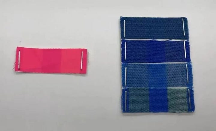
This is also why one color can look identical in one setting and completely different in another. That phenomenon is called metamerism. It’s when colors on the same fabric match under one light source but diverge under another.
In color production, metamerism is the big NO. If a color shifts depending on the light, it’s rejected.

An example of metamerism— the swatches on the left are under daylight lighting and the ones on the right under fluorescent. You can see how the color changes this means the dye formula is unstable. We would reject this color and the dyehouse would need to resubmit. Image from Datacolor.
To test for this, color is evaluated on a neutral grey background. Grey is critical because it removes surrounding color influence (color relativity). Swatches are viewed under multiple light sources, daylight, warm light, and cool light at minimum. If a color can’t hold across those conditions, it’s not stable enough for real-world use.
As systems matured and the company grew, we also introduced spectrophotometer software. These tools read color objectively rather than relying on personal perception which matters because everyone sees color slightly differently. We needed a single source of truth when making large production decisions and this software helped streamline the approval process.

Spectrophotometer, image from Datacolor
Being part of building out and helping define how the company makes color was an exciting career moment for me! Below are a few styles and colors I worked on while I was there.


Images from Alo

Image from Alo
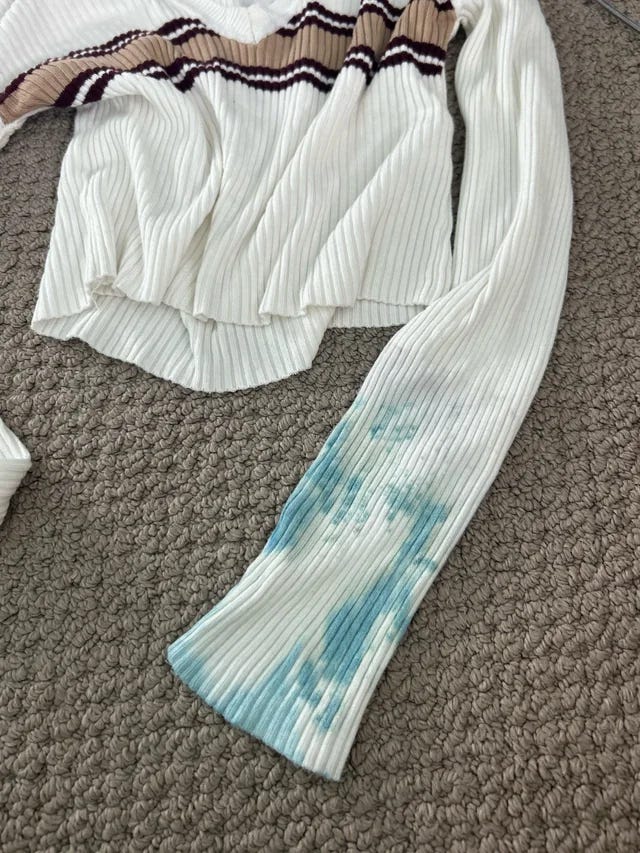
This image is a good example of how color behaves in the real world. These pieces were approved as the same Pantone, but because the fabrics are different, they reflect light differently and end up reading as slightly different tones.
Understanding how color is built is the foundation. Next, I’ll explore color theory and how colors relate to one another, and why certain pairings feel effortless while others never quite work.
That’s all for now, class dismissed!